UW Graduate Students of Art History website and logo
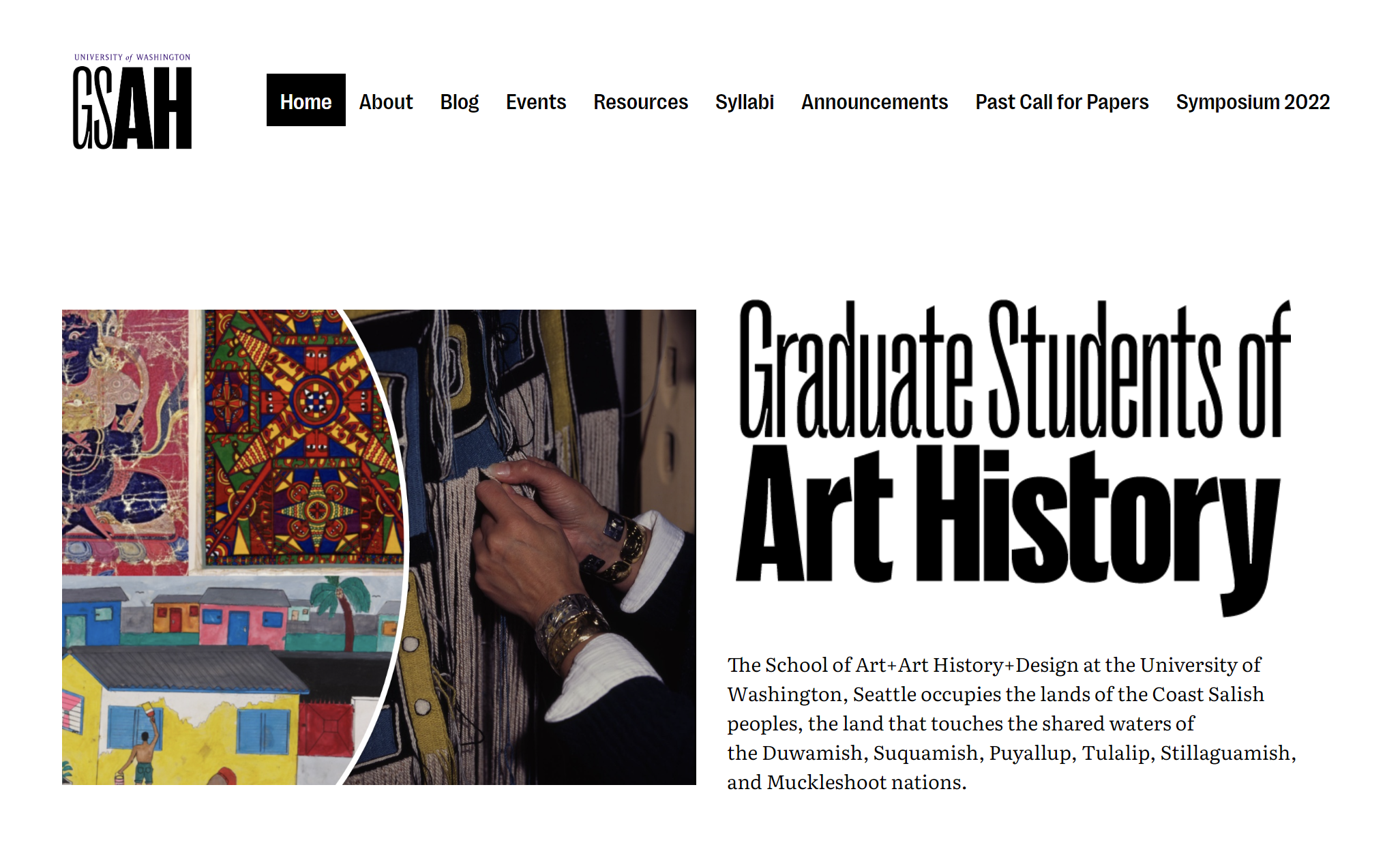
The GSAH homepage features an introduction beside paintings from outside the Western Canon. This site demanded many different page categories, so on screens where they fit, we were able to list them all.
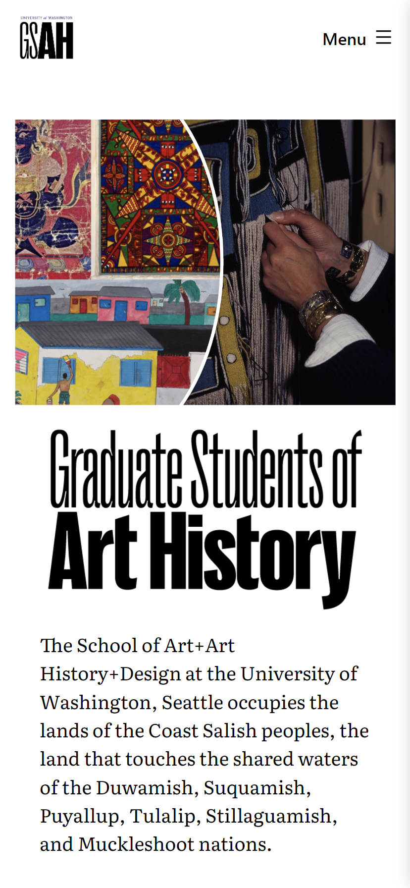
Whereas on screen sizes too small to fit the categories, we let an expanable menu work its magic.
I designed and built the website and blog, including a wordmark and logo, for the UW’s Graduate Students of Art History (GSAH). Specifically, they blog about talks given to and by their anti-racist reading group, Dismantling the Canon.

The GSAH abbreviated logo, where the initials match the weight of the words in the longer wordmark.
The logo must be formal—GSAH is an academic organization. It also had to convey a modernity and poise that a progressive reading group like Dismantling the Canon evokes. To achieve that combination, I use Pangram Pangram’s Right Grotesk, a skinnier sans serif with striking inktraps and just enough traditionality.
The website’s navigation
The navigation menu makes only stylistic changes to the default WordPress theme’s: pure black and white, and use of the logo font, Right Grotesk. There are enough items to warrant multiple screen width collapses: multiple rows when on a screen as wide as a tablet, and eventually an expandable hamburger menu on the narrowest screens.
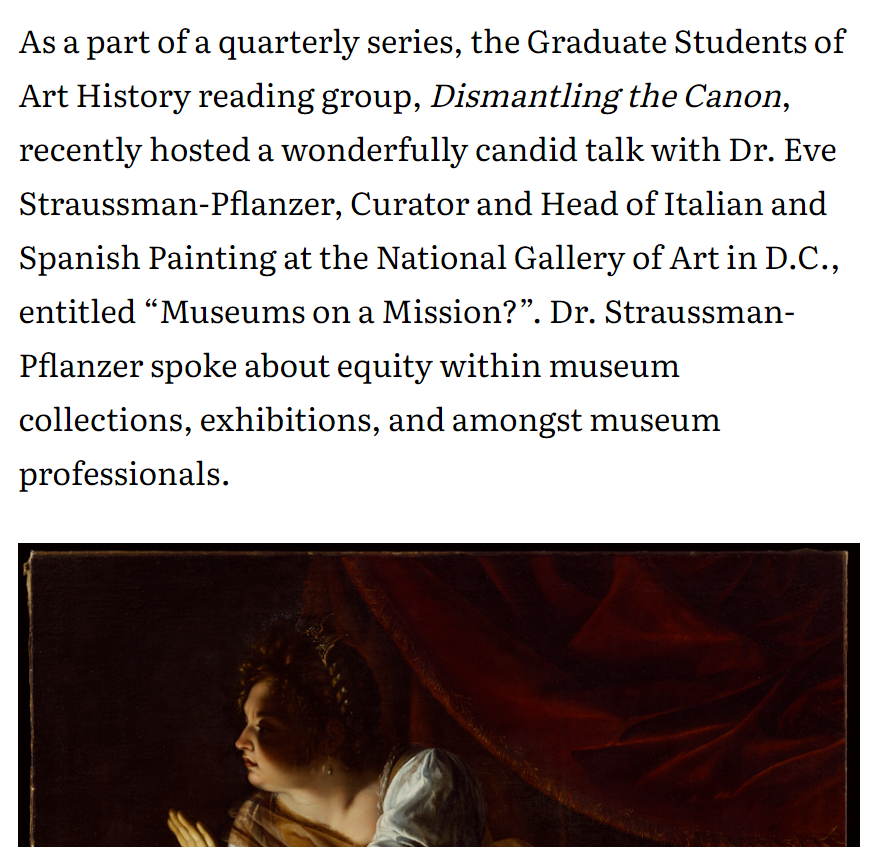
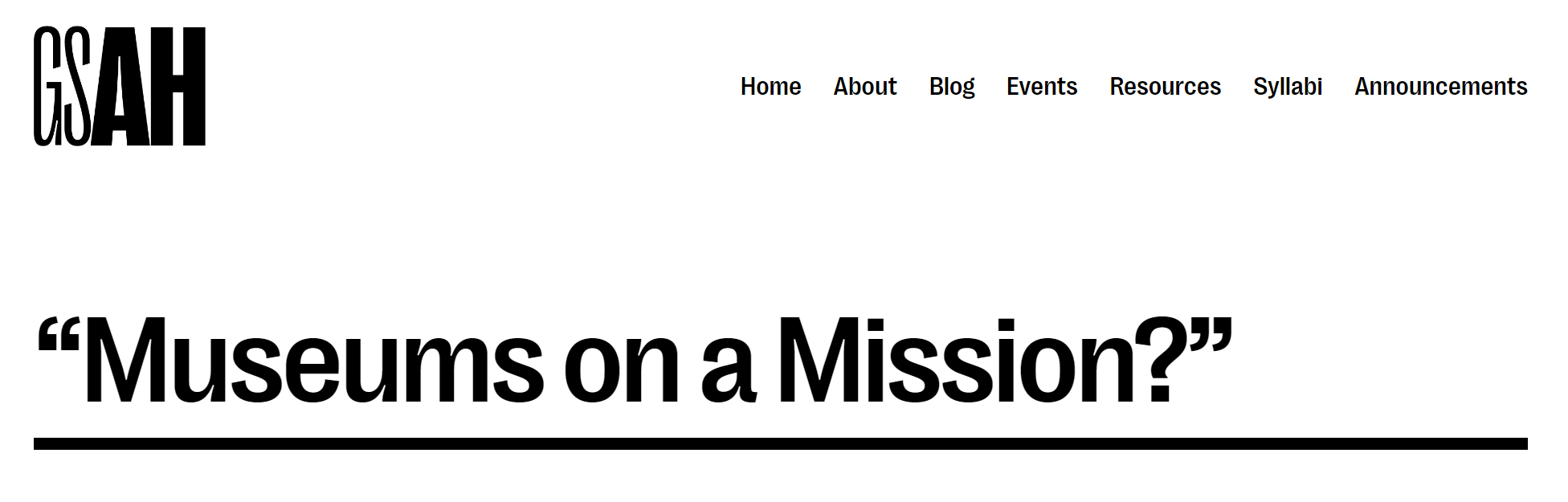
Blog posts use a narrow column width for ease of reading.
Accessibility is a primary consideration in every website, and GSAH’s commitment to diversity only makes it more important. The blog posts are set in a column width for a comfortable, newspaper-esque read, and the text size is large by default to accommodate vision-impaired readers.